What is this (famous) “fold”?
The “above the fold” concept is borrowed from the newspaper industry; news stories printed towards the top of the front page helped to sell more newspapers. In the web context, it refers to the part of the content that’s immediately visible when the screen loads.
Is the fold concept still relevant?
The short answer is YES. BUT with the accelerated adoption of more progressive design practices, designers have turned away from “above the fold” to focus more on full-screen content that’s generously spaced out – and with good reason.
Thanks to a study by the HUGE agency, we know that most users have developed the reflex scroll.
However, a recent Nielsen report reveals that, regardless of our natural tendency to scroll, most users still place great importance on content that appears at the top of the page.
This is a challenge that we often face with projects, when we try to align business goals with a design that leaves ample room for content.
The problem
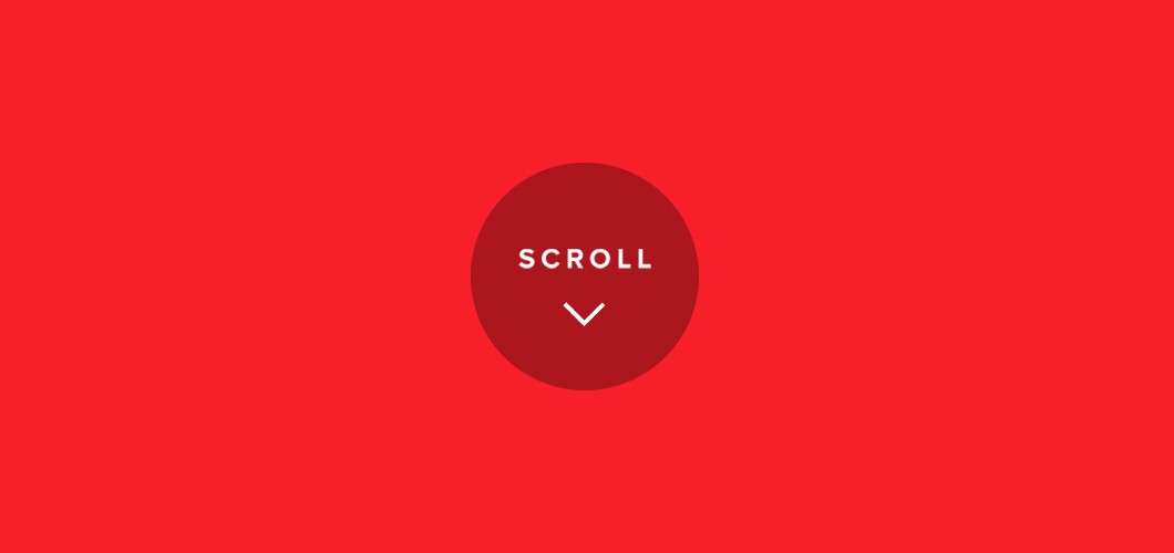
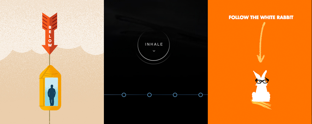
The graphic solution that’s most often used is the ubiquitous indicative arrow, usually accompanied by a label that directly asks you to scroll.

This practice is a design fail. It’s merely creating a button that, visually, does not appear to be clickable and adding the words “Click here” without providing context or an actual reason to click. The alternative would be to redesign the button and include a more specific call to action.
Here are some examples of this practice :
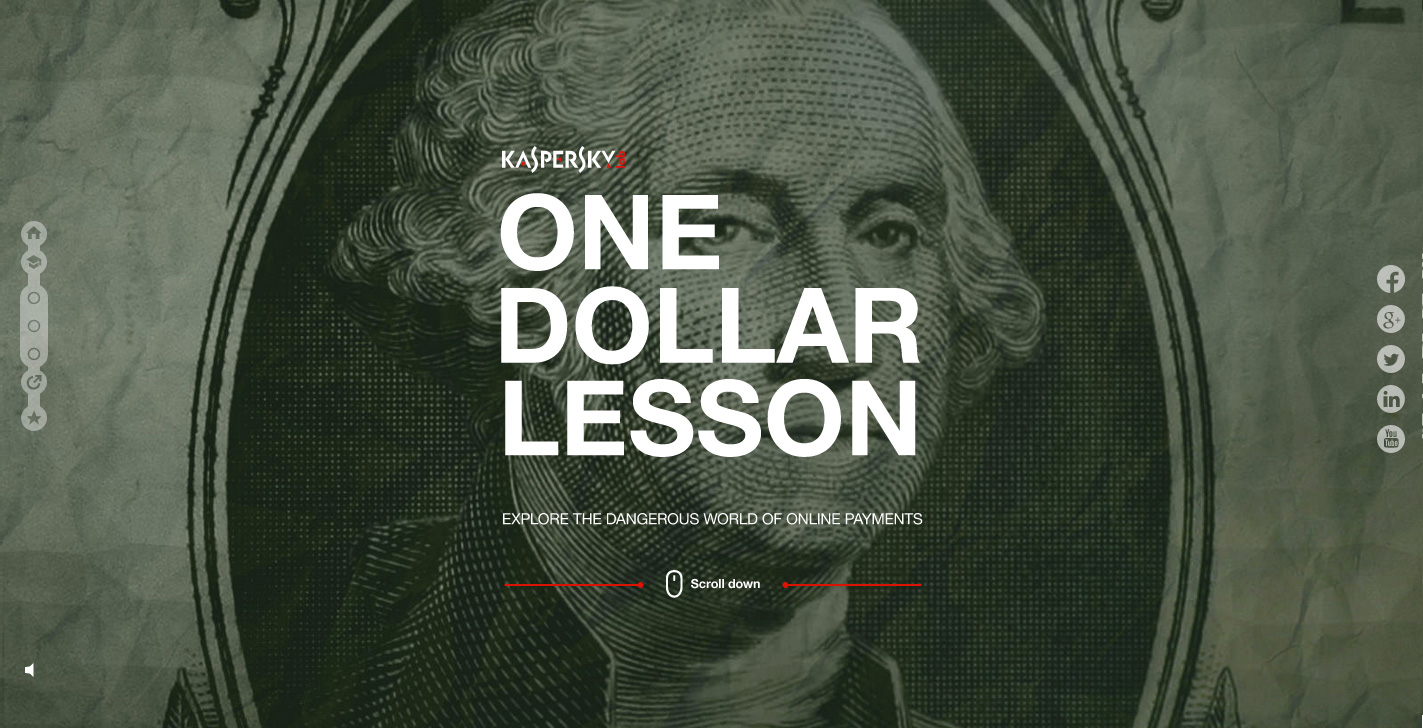
On onedollarlesson.com, written instructions encourage you to scroll down.

Weblounge.be has a tiny mouse icon asking users to scroll and view content below, but it’s so small that users probably miss it.
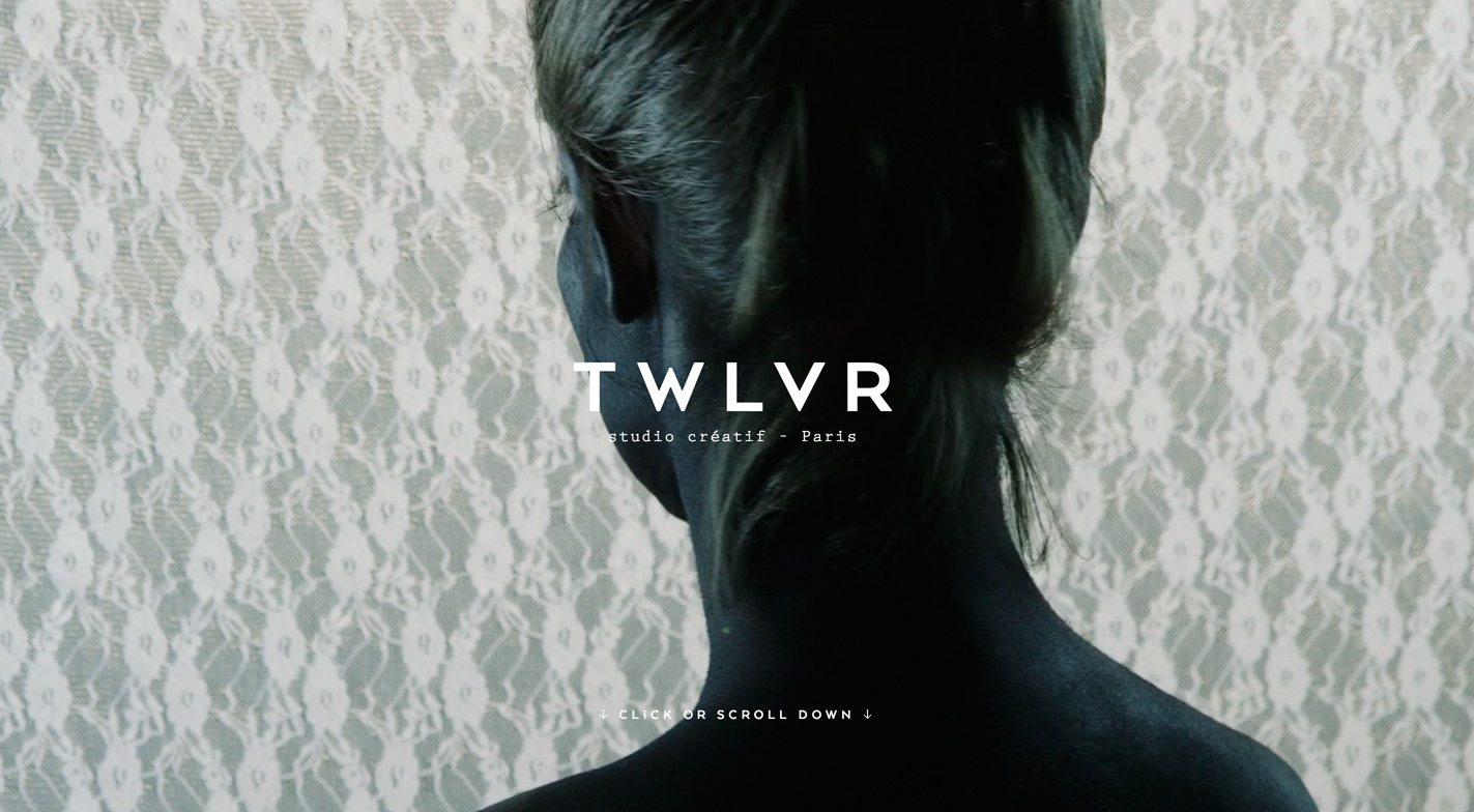
On twlvr.com, text is used to encourage us to scroll down.
This practice isn’t all that problematic in itself, but our responsibility, as designers, is to find creative solutions that will compel users to explore content below the fold, regardless of their intentions. Here are some creative solutions.
Solutions
Storytelling
In the case of more experiential and immersive sites, scrolling is a great tool that enhances the narrative and reinforces the linear aspect of the experience.
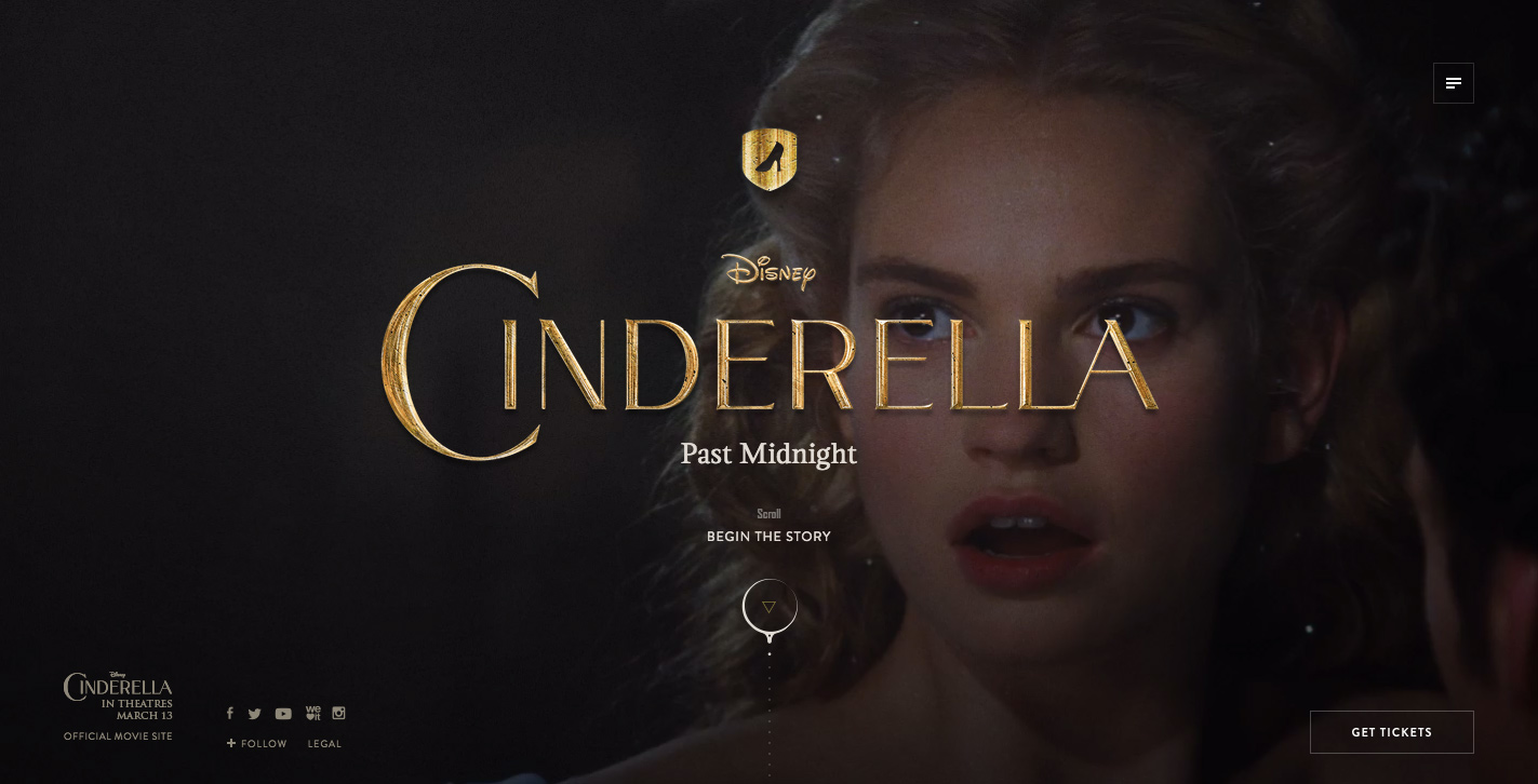
The experiential website cinderellapastmidnight.tumblr.com uses scrolling to tell a story and help users explore content gradually.
Readjust content
Written content obviously helps contextualize users, but it also reinforces the brand’s personality. Well-developed copy can make a considerable difference to the overall experience.
Some sites, such as lostworldsfairs.com/atlantis, aquatilis.tv and hegartyonadvertising.com, use bold copy to make the exploration of content a more satisfying experience.
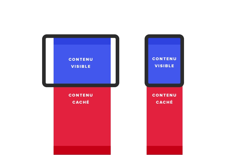
Fixed elements
Thanks to the evolution of mobile and web development tools, it is now easy to identify visible content on a web page (viewport). Partial display of hidden content is a simple and effective way of pointing users to what lies below the fold.
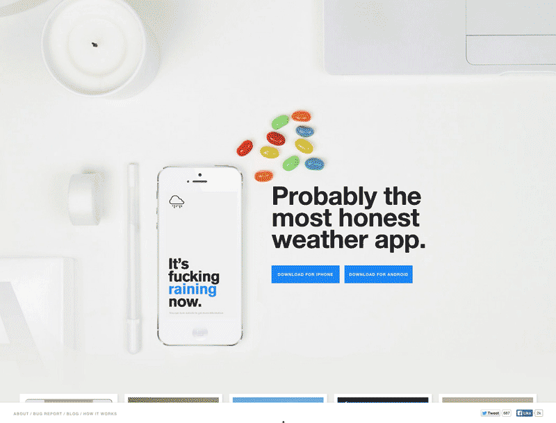
On authenticweather.com, partially visible elements along the bottom of the page indicate there is more content waiting below.
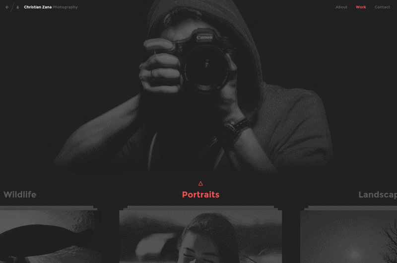
The same concept is used on the home page of this photographer’s website.
In short
The accelerated evolution of mobile and web technologies has a huge influence on the navigation habits of users. The scrolling reflex is becoming more natural for a greater number of users, but the fold concept is increasingly less relevant.
Nonetheless, as a designer, it’s crucial to always guide users through navigation and offer them contextual motivation that makes their online experience a satisfying one.
Do you have an opinion on this topic? Do you deal with similar challenges in your projects? If so, what solutions have you found to be effective?